Normal Distributions and the Central Limit Theorem
Wednesday, July 16, 2025
Visualizing Normal Distributions
Show the code
# Create different normal distributions
x = np.linspace(-8, 8, 1000)

# Different means, same standard deviation
y1 = norm.pdf(x, loc=0, scale=1)    # μ=0, σ=1
y2 = norm.pdf(x, loc=2, scale=1)    # μ=2, σ=1
y3 = norm.pdf(x, loc=-2, scale=1)   # μ=-2, σ=1

plt.figure(figsize=(10, 6))
plt.plot(x, y1, 'b-', linewidth=2, label='μ=0, σ=1')
plt.plot(x, y2, 'r-', linewidth=2, label='μ=2, σ=1')
plt.plot(x, y3, 'g-', linewidth=2, label='μ=-2, σ=1')

plt.title('Normal Distributions with Different Means', fontsize=14, fontweight='bold')
plt.xlabel('Value')
plt.ylabel('Probability Density')
plt.legend()
plt.grid(True, alpha=0.3)
plt.show()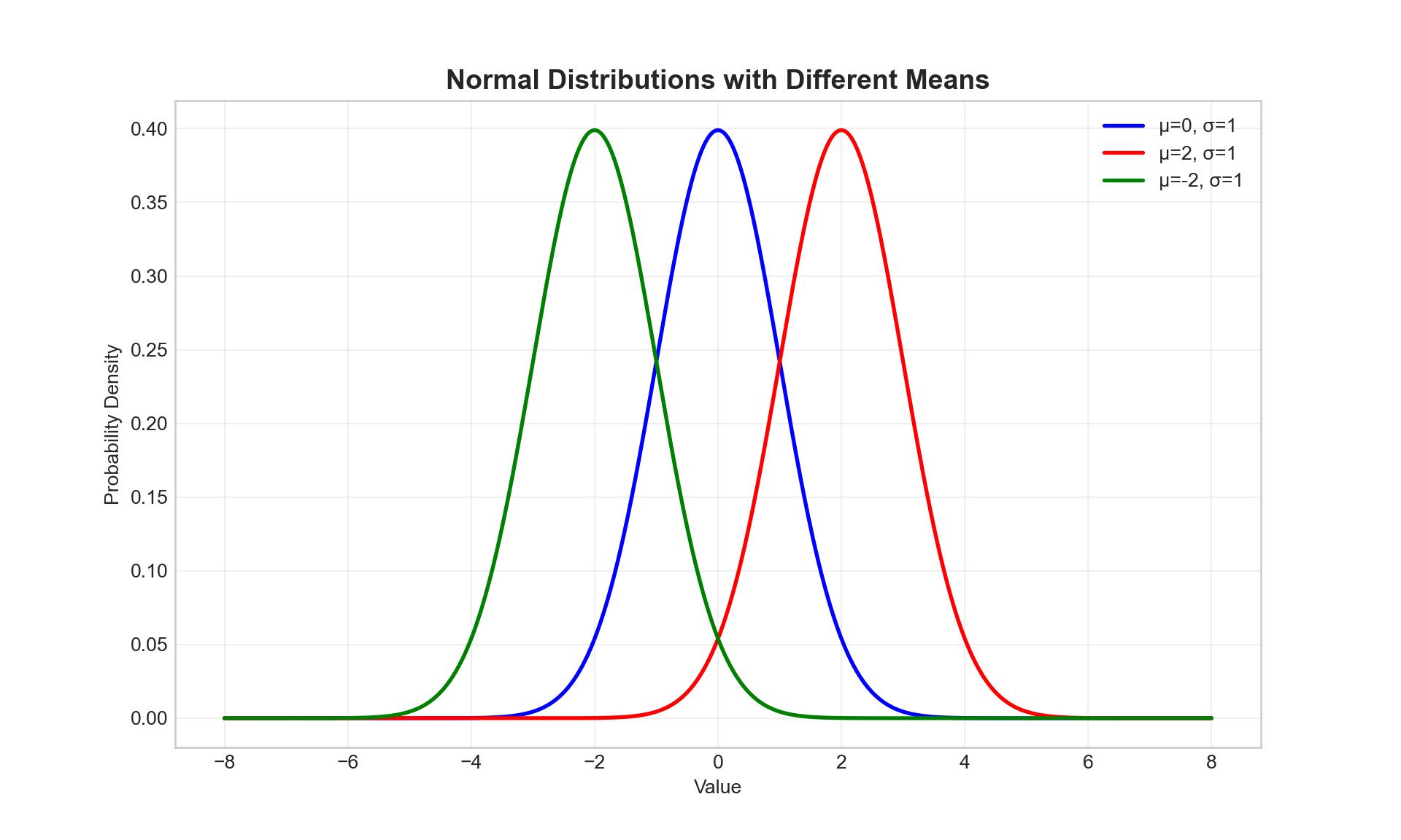
Effect of Standard Deviation
Show the code
# Same mean, different standard deviations
x = np.linspace(-8, 8, 1000)

y1 = norm.pdf(x, loc=0, scale=0.5)  # μ=0, σ=0.5
y2 = norm.pdf(x, loc=0, scale=1)    # μ=0, σ=1
y3 = norm.pdf(x, loc=0, scale=2)    # μ=0, σ=2

plt.figure(figsize=(10, 6))
plt.plot(x, y1, 'b-', linewidth=2, label='μ=0, σ=0.5')
plt.plot(x, y2, 'r-', linewidth=2, label='μ=0, σ=1')
plt.plot(x, y3, 'g-', linewidth=2, label='μ=0, σ=2')

plt.title('Normal Distributions with Different Standard Deviations', fontsize=14, fontweight='bold')
plt.xlabel('Value')
plt.ylabel('Probability Density')
plt.legend()
plt.grid(True, alpha=0.3)
plt.show()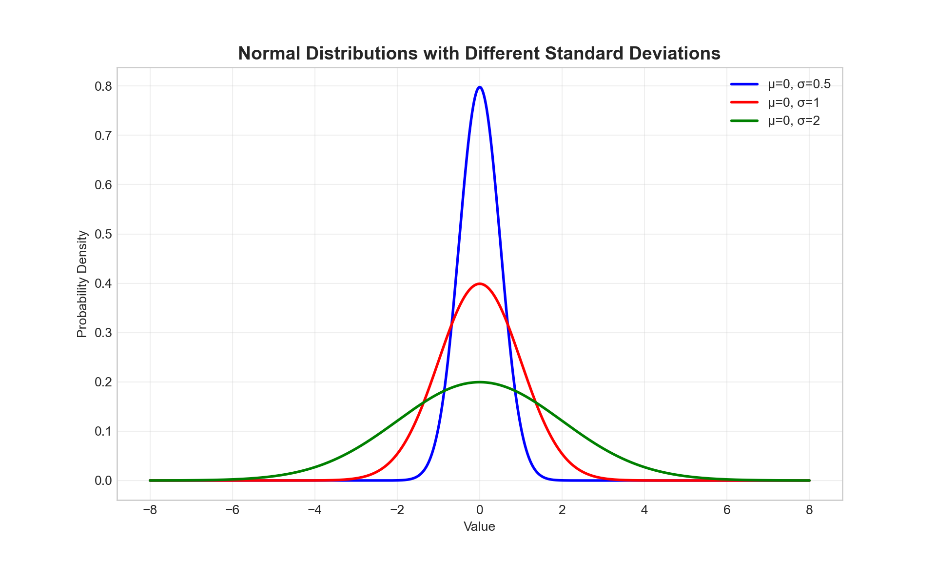
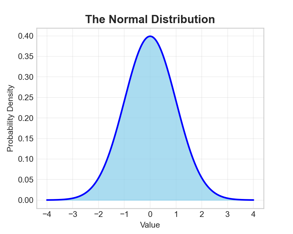
The Standard Normal Distribution
The standard normal distribution is a special case where μ = 0 and σ = 1.
Show the code
# Standard normal distribution with empirical rule
x = np.linspace(-4, 4, 1000)
y = norm.pdf(x, 0, 1)

plt.figure(figsize=(10, 6))

# Fill areas for empirical rule
plt.fill_between(x, y, where=(x >= -1) & (x <= 1), alpha=0.3, color='green', label='68% (±1σ)')
plt.fill_between(x, y, where=(x >= -2) & (x <= 2), alpha=0.2, color='orange', label='95% (±2σ)')
plt.fill_between(x, y, where=(x >= -3) & (x <= 3), alpha=0.1, color='red', label='99.7% (±3σ)')

plt.plot(x, y, 'black', linewidth=2)
plt.axvline(0, color='black', linestyle='--', alpha=0.5)

plt.title('Standard Normal Distribution - Empirical Rule', fontsize=14, fontweight='bold')
plt.xlabel('Standard deviations from mean')
plt.ylabel('Probability Density')
plt.legend()
plt.grid(True, alpha=0.3)
plt.show()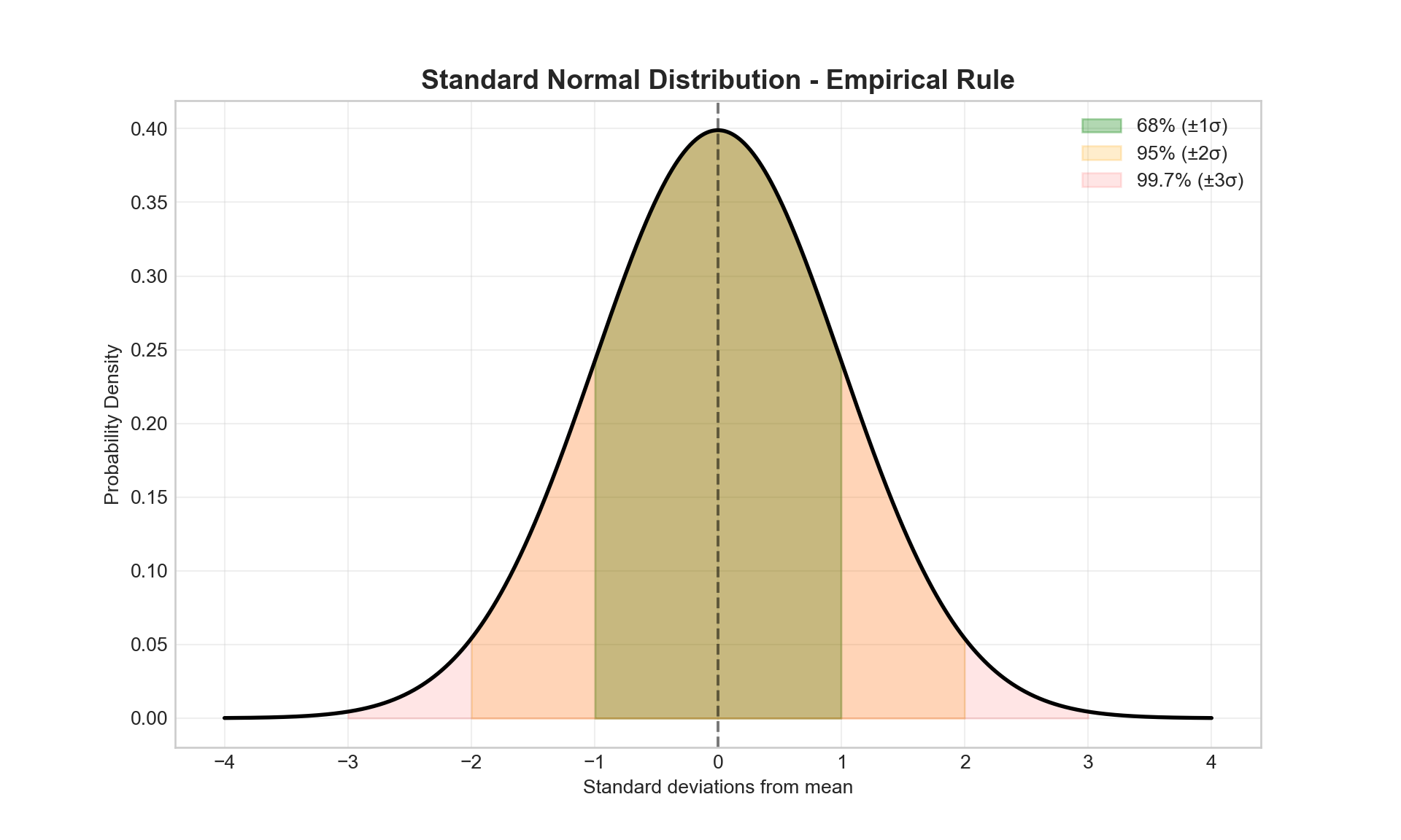
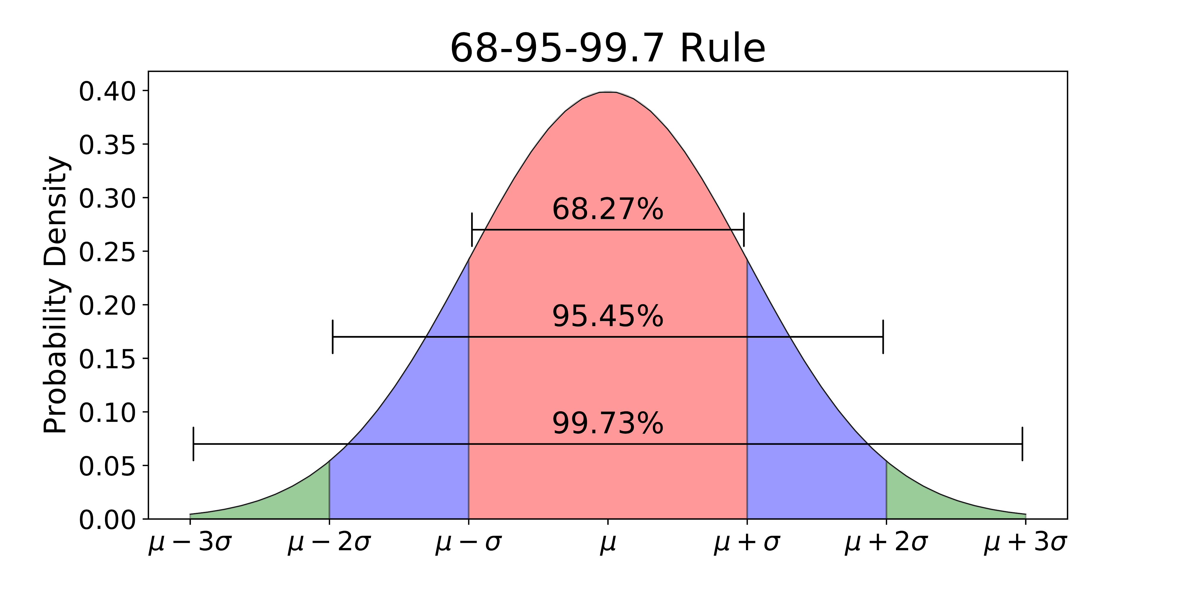
68 - 95 - 99.7 Rule
Real-World Example: Heights
Human heights often follow a normal distribution.
Show the code
# Simulate height data (in cm)
np.random.seed(42)
male_heights = np.random.normal(175, 7, 1000)    # μ=175cm, σ=7cm
female_heights = np.random.normal(162, 6, 1000)  # μ=162cm, σ=6cm

plt.figure(figsize=(10, 6))
plt.hist(male_heights, bins=30, alpha=0.7, label='Male Heights', density=True)
plt.hist(female_heights, bins=30, alpha=0.7, label='Female Heights', density=True)

# Overlay theoretical curves
x_male = np.linspace(150, 200, 1000)
x_female = np.linspace(140, 185, 1000)
plt.plot(x_male, norm.pdf(x_male, 175, 7), 'b-', linewidth=2)
plt.plot(x_female, norm.pdf(x_female, 162, 6), 'orange', linewidth=2)

plt.title('Distribution of Heights', fontsize=14, fontweight='bold')
plt.xlabel('Height (cm)')
plt.ylabel('Density')
plt.legend()
plt.grid(True, alpha=0.3)
plt.show()
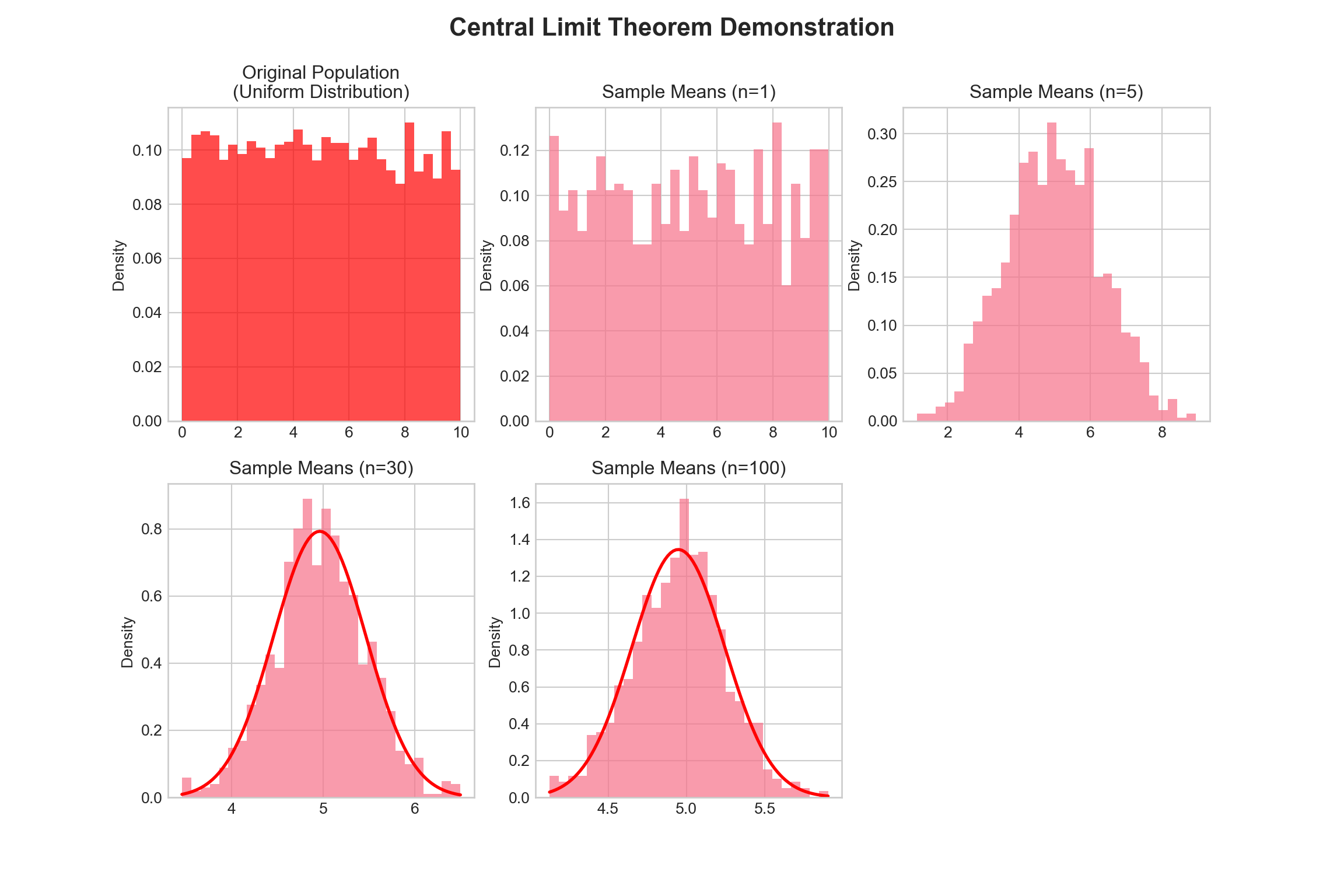
CLT Demonstration: Uniform Distribution
Let’s start with a uniform distribution (definitely not normal!):
Show the code
# Set up the demonstration
np.random.seed(42)
population = np.random.uniform(0, 10, 10000)  # Uniform distribution from 0 to 10

sample_sizes = [1, 5, 30, 100]
sample_means = {n: [] for n in sample_sizes}

# Generate sample means for different sample sizes
for n in sample_sizes:
    for _ in range(1000):
        sample = np.random.choice(population, n)
        sample_means[n].append(np.mean(sample))

# Create subplots
fig, axes = plt.subplots(2, 3, figsize=(12, 8))
fig.suptitle('Central Limit Theorem Demonstration', fontsize=16, fontweight='bold');

# Plot original population
axes[0, 0].hist(population, bins=30, alpha=0.7, color='red', density=True);
axes[0, 0].set_title('Original Population\n(Uniform Distribution)');
axes[0, 0].set_ylabel('Density');

# Plot sample means for different sample sizes
positions = [(0, 1), (0, 2), (1, 0), (1, 1)]
for i, n in enumerate(sample_sizes):
    row, col = positions[i];
    axes[row, col].hist(sample_means[n], bins=30, alpha=0.7, density=True);
    axes[row, col].set_title(f'Sample Means (n={n})');
    axes[row, col].set_ylabel('Density');

    # Overlay normal curve for larger sample sizes
    if n >= 30:
        x = np.linspace(min(sample_means[n]), max(sample_means[n]), 100);
        mu = np.mean(sample_means[n]);
        sigma = np.std(sample_means[n]);
        axes[row, col].plot(x, norm.pdf(x, mu, sigma), 'r-', linewidth=2)
(array([0.12637529, 0.093277 , 0.10230381, 0.08425019, 0.10230381,
0.11734848, 0.10230381, 0.10531274, 0.10230381, 0.07823232,
0.07823232, 0.10531274, 0.08725913, 0.11133061, 0.08425019,
0.11734848, 0.10230381, 0.09026806, 0.11433955, 0.11133061,
0.08725913, 0.07823232, 0.12035742, 0.08725913, 0.13239316,
0.06017871, 0.10531274, 0.08124126, 0.12035742, 0.12035742]), array([5.97938835e-03, 3.38322841e-01, 6.70666294e-01, 1.00300975e+00,
1.33535320e+00, 1.66769665e+00, 2.00004011e+00, 2.33238356e+00,
2.66472701e+00, 2.99707046e+00, 3.32941392e+00, 3.66175737e+00,
3.99410082e+00, 4.32644428e+00, 4.65878773e+00, 4.99113118e+00,
5.32347463e+00, 5.65581809e+00, 5.98816154e+00, 6.32050499e+00,
6.65284845e+00, 6.98519190e+00, 7.31753535e+00, 7.64987880e+00,
7.98222226e+00, 8.31456571e+00, 8.64690916e+00, 8.97925262e+00,
9.31159607e+00, 9.64393952e+00, 9.97628297e+00]), <BarContainer object of 30 artists>)
Text(0.5, 1.0, 'Sample Means (n=1)')
Text(0, 0.5, 'Density')
(array([0.00769475, 0.00769475, 0.0153895 , 0.01923688, 0.030779 ,
0.08079488, 0.10387913, 0.13081076, 0.13850551, 0.16543713,
0.21545301, 0.26931626, 0.28085839, 0.24623201, 0.31163739,
0.27316364, 0.26162151, 0.24623201, 0.28470577, 0.15004763,
0.15389501, 0.13850551, 0.09233701, 0.08848963, 0.061558 ,
0.02693163, 0.01154213, 0.02308425, 0.00384738, 0.00769475]), array([1.14761917, 1.40753663, 1.66745409, 1.92737155, 2.18728902,
2.44720648, 2.70712394, 2.9670414 , 3.22695886, 3.48687632,
3.74679379, 4.00671125, 4.26662871, 4.52654617, 4.78646363,
5.04638109, 5.30629856, 5.56621602, 5.82613348, 6.08605094,
6.3459684 , 6.60588587, 6.86580333, 7.12572079, 7.38563825,
7.64555571, 7.90547317, 8.16539064, 8.4253081 , 8.68522556,
8.94514302]), <BarContainer object of 30 artists>)
Text(0.5, 1.0, 'Sample Means (n=5)')
Text(0, 0.5, 'Density')
(array([0.05933713, 0.01977904, 0.02966857, 0.03955809, 0.0890057 ,
0.14834283, 0.16812187, 0.27690661, 0.33624374, 0.42524943,
0.38569135, 0.70215604, 0.80105126, 0.89005695, 0.69226652,
0.86038839, 0.78127221, 0.64281891, 0.60326082, 0.39558087,
0.46480752, 0.35602278, 0.25712756, 0.1384533 , 0.09889522,
0.11867426, 0.00988952, 0.00988952, 0.04944761, 0.03955809]), array([3.46094648, 3.56206361, 3.66318073, 3.76429786, 3.86541498,
3.96653211, 4.06764923, 4.16876636, 4.26988348, 4.37100061,
4.47211773, 4.57323486, 4.67435198, 4.77546911, 4.87658623,
4.97770336, 5.07882048, 5.17993761, 5.28105473, 5.38217186,
5.48328898, 5.58440611, 5.68552323, 5.78664035, 5.88775748,
5.9888746 , 6.08999173, 6.19110885, 6.29222598, 6.3933431 ,
6.49446023]), <BarContainer object of 30 artists>)
Text(0.5, 1.0, 'Sample Means (n=30)')
Text(0, 0.5, 'Density')
[<matplotlib.lines.Line2D object at 0x000000006E699A30>]
(array([0.11818307, 0.08441648, 0.11818307, 0.11818307, 0.33766592,
0.35454921, 0.4051991 , 0.60779865, 0.64156524, 0.84416479,
1.09741422, 1.02988104, 1.16494741, 1.30001377, 1.62079639,
1.31689707, 1.33378037, 1.09741422, 0.91169797, 0.57403206,
0.52338217, 0.4051991 , 0.4051991 , 0.15194966, 0.10129977,
0.05064989, 0.08441648, 0.05064989, 0. , 0.03376659]), array([4.12606403, 4.18529417, 4.24452431, 4.30375445, 4.36298459,
4.42221474, 4.48144488, 4.54067502, 4.59990516, 4.6591353 ,
4.71836544, 4.77759559, 4.83682573, 4.89605587, 4.95528601,
5.01451615, 5.07374629, 5.13297644, 5.19220658, 5.25143672,
5.31066686, 5.369897 , 5.42912714, 5.48835728, 5.54758743,
5.60681757, 5.66604771, 5.72527785, 5.78450799, 5.84373813,
5.90296828]), <BarContainer object of 30 artists>)
Text(0.5, 1.0, 'Sample Means (n=100)')
Text(0, 0.5, 'Density')
[<matplotlib.lines.Line2D object at 0x000000006C5EB980>]