This is a commonly used data structure in data science. It is tabular data structure with some constraints that make it simpler to work with.
Every row is an observation in the data.
Every column is a variable in the data.
A variable will have a specific data type e.g. number, text, date.
We will make frequent use of pandas dataframes.
Creating Data Points in Python
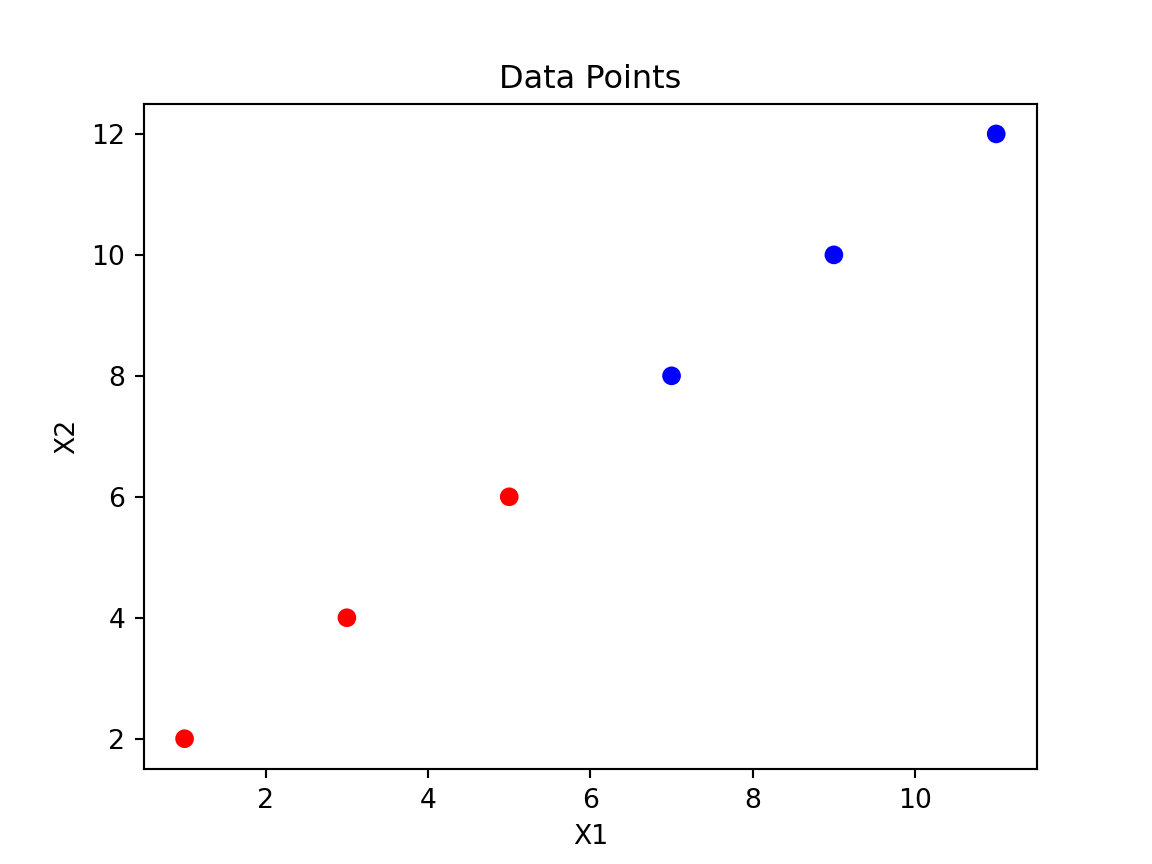
import pandas as pd# Create a DataFrame with six varied data pointsdata = {'X1': [1, 3, 5, 7, 9, 11],'X2': [2, 4, 6, 8, 10, 12],'y': ['red', 'red', 'red', 'blue', 'blue', 'blue']}df = pd.DataFrame(data)# Map 'red' to 0 and 'blue' to 1color_map = {'red': 0, 'blue': 1}df['y'] = df['y'].map(color_map)
X1
X2
y
1
2
0
3
4
0
5
6
0
7
8
1
9
10
1
11
12
1
Exercise: DataFrame practice
Create a DataFrame with 10 random integers between 1 and 100, compute the mean of the column, and add a new Boolean column indicating whether each value is above the mean.
\[
d = \sqrt{\sum_{i=1}^{n} (x_{i_2} - x_{i_1})^2}
\]
where \(x_{i1}\) and \(x_{i2}\) are the coordinates of the two points in the \(i\)-th dimension.
Part 3: Supervised Machine Learning
In this section we look at practical examples of supervised learning using scikit-learn. We’ll revisit the Titanic dataset and build models, then explore k-NN, logistic regression and the Iris dataset.
Titanic dataset – preparing the data
# Import the modulefrom sklearn.model_selection import train_test_split# Reload and prepare the Titanic datasetimport pandas as pdtitanic = pd.read_csv("data/titanic.csv")X = titanic.drop("Survived", axis=1).valuesy = titanic["Survived"].values# Split into training and test setsX_train, X_test, y_train, y_test = train_test_split( X, y, test_size=0.2, random_state=42, stratify=y)print(f"train target proportion: {y_train.sum()/len(y_train):.3f}")
Re-split the data using a 30% test set and print the proportions again.
Solution
0.38362760834670945
0.3843283582089552
Explanation of Variables
X1 and X2 are independent variables.
y is the target variable, which is binary (0 for red, 1 for blue).
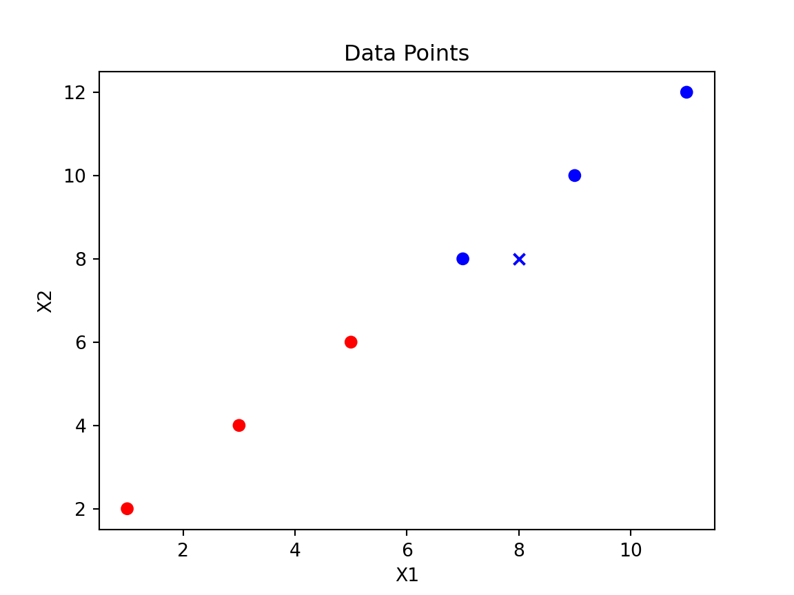
Plotting Data Points using Matplotlib
import matplotlib.pyplot as plt# Plot the data pointscolors = {0: 'r', 1: 'b'}plt.scatter(df['X1'], df['X2'], c=df['y'].map(colors))plt.xlabel('X1')plt.ylabel('X2')plt.title('Data Points')plt.show()
scikit-learn Syntax
from scikit-learn.module import Model# Create an instance of the modelmodel = Model()# Fit the model to the datamodel.fit(X, y)# Make predictions on new datapredictions = model.predict(X_new)# Print the predictionsprint(predictions)
scikit-learn Syntax with Train Test Split
from scikit-learn.module import Modelfrom sklearn.model_selection import train_test_split# Create an instance of the modelmodel = Model()# Split the dataset into training and testing setsX_train, X_test, y_train, y_test = train_test_split(X, y, test_size=prop)# Fit the model to the datamodel.fit(X_train, y_train)# Make predictions on new datapredictions = model.predict(X_test)# Print the accuracyprint(model.score(X_test, y_test))
k-NN Example
from sklearn.neighbors import KNeighborsClassifierimport numpy as np# Prepare the dataX = df[['X1', 'X2']].valuesy = df['y'].values# Create and train the k-NN classifierknn = KNeighborsClassifier(n_neighbors=3)knn.fit(X, y)
KNeighborsClassifier(n_neighbors=3)
In a Jupyter environment, please rerun this cell to show the HTML representation or trust the notebook. On GitHub, the HTML representation is unable to render, please try loading this page with nbviewer.org.
KNeighborsClassifier(n_neighbors=3)
# Predict the class of a new pointnew_point = np.array([[8, 8]])predicted_class = knn.predict(new_point)predicted_color ='red'if predicted_class ==0else'blue'print(f'The new point {new_point} is classified as {predicted_color}.')
k-NN Example Output
KNeighborsClassifier(n_neighbors=3)
In a Jupyter environment, please rerun this cell to show the HTML representation or trust the notebook. On GitHub, the HTML representation is unable to render, please try loading this page with nbviewer.org.
Change the number of neighbours to 5 and try classifying point [2,2]. What colour do you get?
Solution
KNeighborsClassifier()
In a Jupyter environment, please rerun this cell to show the HTML representation or trust the notebook. On GitHub, the HTML representation is unable to render, please try loading this page with nbviewer.org.
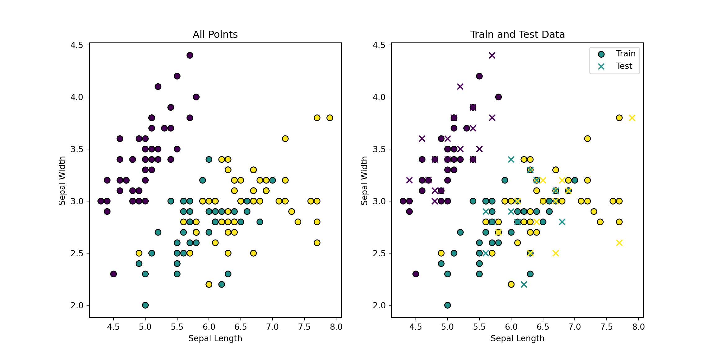
from sklearn.datasets import load_irisfrom sklearn.model_selection import train_test_splitfrom sklearn.neighbors import KNeighborsClassifierimport numpy as npimport matplotlib.pyplot as plt# Load the iris datasetiris = load_iris()X = iris.data[:, :2] # Use only the first two featuresy = iris.target# Split the dataset into training and testing setsX_train, X_test, y_train, y_test = train_test_split(X, y, test_size=0.3, random_state=42)# Plot all pointsplt.figure(figsize=(12, 6))plt.subplot(1, 2, 1)plt.scatter(X[:, 0], X[:, 1], c=y, cmap='viridis', edgecolor='k', s=50)plt.title('All Points')plt.xlabel('Sepal Length')plt.ylabel('Sepal Width')# Plot train and test data separatelyplt.subplot(1, 2, 2)plt.scatter(X_train[:, 0], X_train[:, 1], c=y_train, cmap='viridis', edgecolor='k', s=50, label='Train')plt.scatter(X_test[:, 0], X_test[:, 1], c=y_test, cmap='viridis', edgecolor='k', s=50, label='Test', marker='x')plt.title('Train and Test Data')plt.xlabel('Sepal Length')plt.ylabel('Sepal Width')plt.legend()plt.show()
# Create and train the k-NN classifierknn = KNeighborsClassifier(n_neighbors=3)knn.fit(X_train, y_train)
KNeighborsClassifier(n_neighbors=3)
In a Jupyter environment, please rerun this cell to show the HTML representation or trust the notebook. On GitHub, the HTML representation is unable to render, please try loading this page with nbviewer.org.
KNeighborsClassifier(n_neighbors=3)
# Predict the class of the test sety_pred = knn.predict(X_test)# Count the number of correct predictionscorrect_predictions = np.sum(y_pred == y_test)total_predictions =len(y_test)print(f'Correct predictions: {correct_predictions} out of {total_predictions}')
k-NN Example with Iris Data (Two Variables) Output
KNeighborsClassifier(n_neighbors=3)
In a Jupyter environment, please rerun this cell to show the HTML representation or trust the notebook. On GitHub, the HTML representation is unable to render, please try loading this page with nbviewer.org.
from sklearn.datasets import load_irisfrom sklearn.model_selection import train_test_splitfrom sklearn.neighbors import KNeighborsClassifierimport numpy as np# Load the iris datasetiris = load_iris()X = iris.data # Use all four featuresy = iris.target# Split the dataset into training and testing setsX_train, X_test, y_train, y_test = train_test_split(X, y, test_size=0.3, random_state=42)# Create and train the k-NN classifierknn = KNeighborsClassifier(n_neighbors=3)knn.fit(X_train, y_train)
KNeighborsClassifier(n_neighbors=3)
In a Jupyter environment, please rerun this cell to show the HTML representation or trust the notebook. On GitHub, the HTML representation is unable to render, please try loading this page with nbviewer.org.
KNeighborsClassifier(n_neighbors=3)
# Predict the class of the test sety_pred = knn.predict(X_test)# Count the number of correct predictionscorrect_predictions = np.sum(y_pred == y_test)total_predictions =len(y_test)print(f'Correct predictions: {correct_predictions} out of {total_predictions}')
Exercise: iris all-variables
Change n_neighbors to 5 and re-run the classifier. Did accuracy improve?
Solution
KNeighborsClassifier()
In a Jupyter environment, please rerun this cell to show the HTML representation or trust the notebook. On GitHub, the HTML representation is unable to render, please try loading this page with nbviewer.org.
Try using n_neighbors=5 and report how many correct predictions you get.
Solution
KNeighborsClassifier()
In a Jupyter environment, please rerun this cell to show the HTML representation or trust the notebook. On GitHub, the HTML representation is unable to render, please try loading this page with nbviewer.org.
k-NN Example with Iris Data (All Variables) Output
KNeighborsClassifier(n_neighbors=3)
In a Jupyter environment, please rerun this cell to show the HTML representation or trust the notebook. On GitHub, the HTML representation is unable to render, please try loading this page with nbviewer.org.
from sklearn.linear_model import LogisticRegressionimport numpy as np# Prepare the dataX = df[['X1', 'X2']].valuesy = df['y'].values# Create and train the logistic regression modellog_reg = LogisticRegression()log_reg.fit(X, y)# Predict the class of a new pointnew_point = np.array([[6, 7]])predicted_class = log_reg.predict(new_point)predicted_prob = log_reg.predict_proba(new_point)predicted_color ='red'if predicted_class ==0else'blue'print(f'The new point {new_point} is classified as {predicted_color} with probability {predicted_prob}.')
Logistic Regression Example Output
LogisticRegression()
In a Jupyter environment, please rerun this cell to show the HTML representation or trust the notebook. On GitHub, the HTML representation is unable to render, please try loading this page with nbviewer.org.
The new point [[6 7]] is classified as red with probability [[0.50000894 0.49999106]].
Exercise: logistic prediction
Try predicting a different point such as [2, 9] and print the class and probability.
Solution
[0] [[0.77441402 0.22558598]]
Dimensionality Reduction
Introduction to Dimensionality Reduction
Dimensionality reduction is a technique used to reduce the number of features in a dataset.
It helps in visualizing high-dimensional data and reducing computational complexity.
Common dimensionality reduction techniques include PCA, t-SNE, and LDA.
Principal Component Analysis (PCA)
PCA is a linear dimensionality reduction technique that projects the data onto a lower-dimensional space.
It identifies the directions (principal components) that maximize the variance in the data.
PCA is widely used for data visualization and noise reduction.
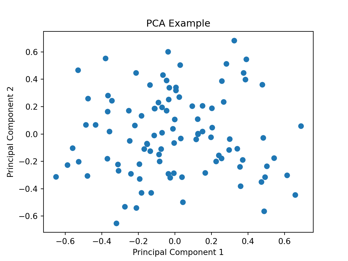
PCA Example
Code
from sklearn.decomposition import PCAimport numpy as npimport matplotlib.pyplot as plt# Generate some sample dataX = np.random.rand(100, 5)# Create and train the PCA modelpca = PCA(n_components=2)X_pca = pca.fit_transform(X)# Plot the PCA-transformed dataplt.scatter(X_pca[:, 0], X_pca[:, 1])plt.title('PCA Example')plt.xlabel('Principal Component 1')plt.ylabel('Principal Component 2')plt.show()
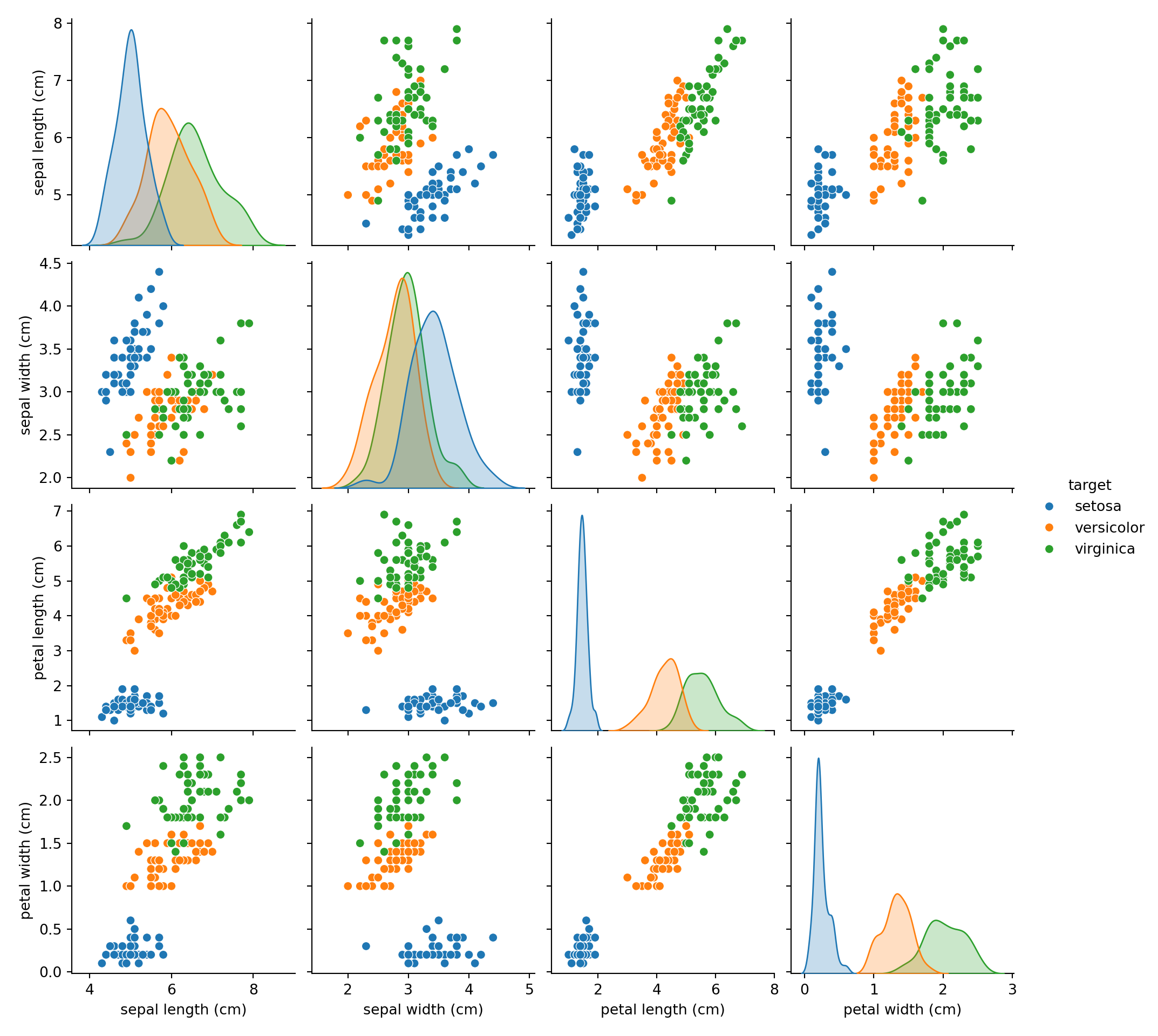
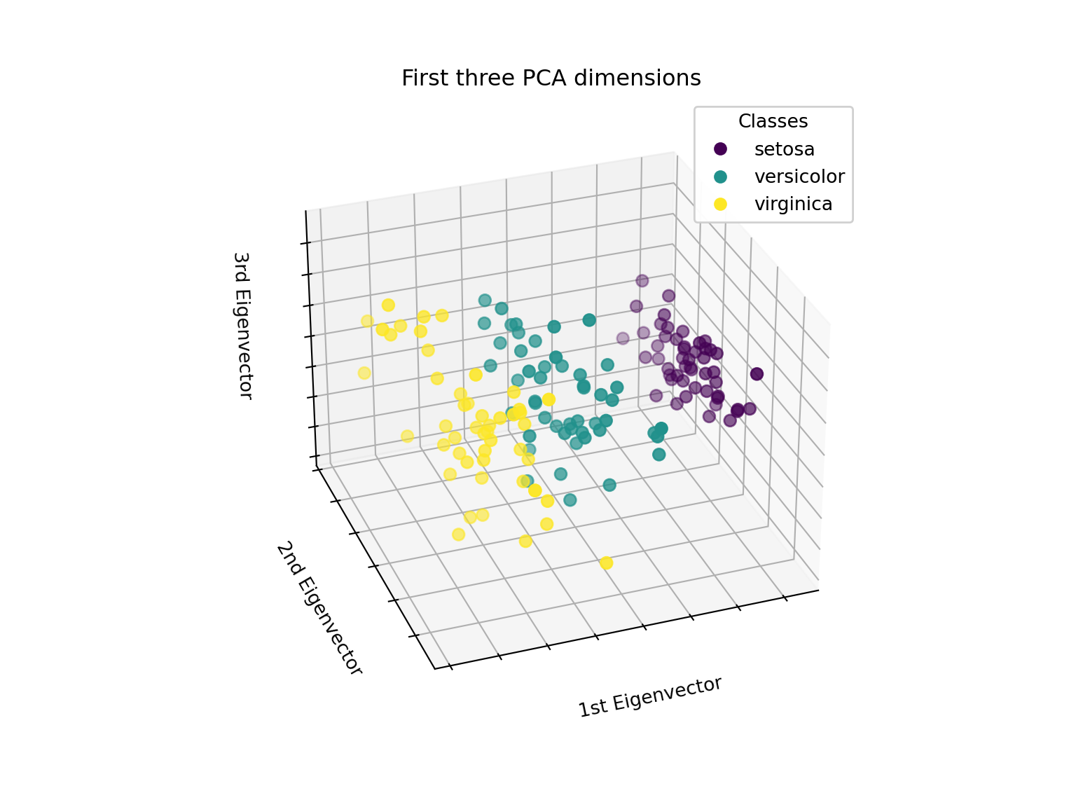
Scikit - Learn Iris Example
# Authors: The scikit-learn developers
# SPDX-License-Identifier: BSD-3-Clause
Scikit - Learn Iris Example cont
Part 4: Visualisation
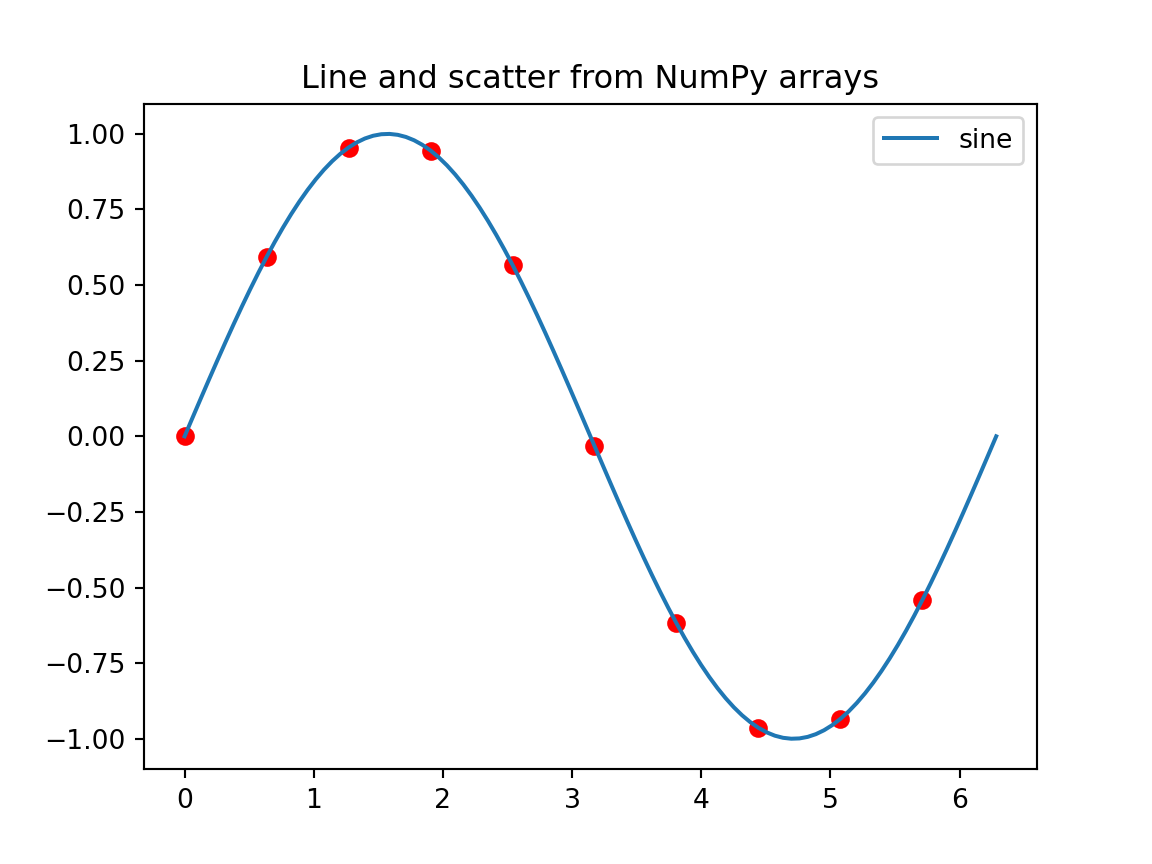
Plotting from NumPy arrays
import numpy as npimport matplotlib.pyplot as pltx = np.linspace(0, 2*np.pi, 100)y = np.sin(x)plt.plot(x, y, label='sine')plt.scatter(x[::10], y[::10], c='red')plt.title('Line and scatter from NumPy arrays')plt.legend()plt.show()
Exercise
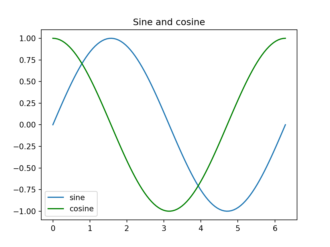
Using the x and y arrays above, plot a cosine curve on the same axes in green.
Solution
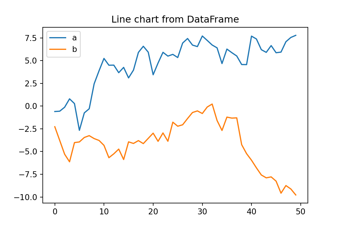
Plotting from pandas DataFrame
import pandas as pdimport numpy as npimport matplotlib.pyplot as pltdf3 = pd.DataFrame({'a': np.random.randn(50).cumsum(),'b': np.random.randn(50).cumsum()})df3.plot(title='Line chart from DataFrame', figsize=(6,4))plt.show()
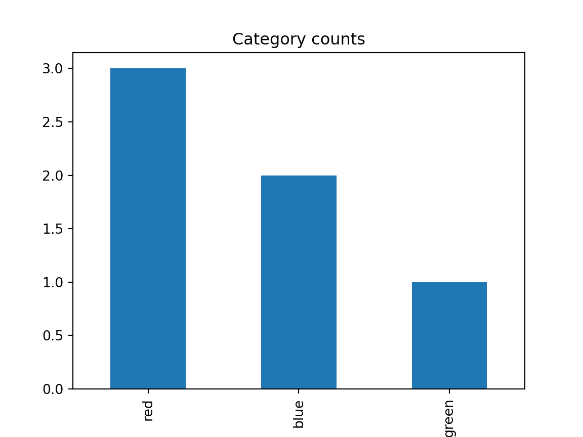
Exercise
Create a bar chart showing the counts of a categorical column in a DataFrame.